Contemporary approach updates natural products
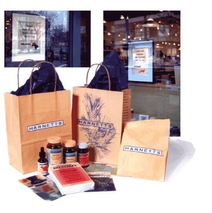
Harnetts, a chain of natural drug stores, retained Izbickas to develop its corporate identity, brand identity and packaging program for a private line of natural care products. In its solution for Harnetts, what were originally referred to as
alternative products have become very much mainstream. Therefore, Izbickas addressed the need to update traditional herbal and homeopathic product packaging and bring them into contemporary terms.
In developing the overall brand identity, the Harnetts name was prominently applied to all products. Harnetts, founded in its roots as the originator of the Bread & Circus grocery chain, establishes the brand as quality and value driven. Next, organic images were treated in a contemporary manner in warm shades of yellow, red and orange to promote a sense of source and security. Then, to further differentiate the Harnetts products from the field of brands housed in brown plastic bottles, Izbickas packaged the line in attractive cobalt blue, glass bottles. All of these features result in a clean visual treatment which creates a sense of purity for the line.
This packaging system is innovative and addresses Harnetts objective of expanding market share without alienating its already existing loyal customer base.
This private label project was honored with the Graphic Design:USA International Brand Packaging Award.
Harnetts
Corporate Identity
Brand Identity
Packaging, Signage, In-Store Graphics
© 2007 Izbickas, All rights reserved. innovate. captivate. motivate!™ is a trademark of Edmund V Izbickas


